
By office analytics: desks and parking
The Desk and Parking places tiles on the By office tab open the same set of five blocks:
- attendance;
- capacity potential;
- average workload by place type;
- average workload by day of the week;
- the usage trend.
They are calculated by identical rules, which is why one article covers both: first in detail for desks, then the differences for parking.
Two tiles: desks and parking
The tiles sit in the top row of the page and work as switches: clicking a tile changes the set of charts below it. Each tile carries four numbers.
| On the tile | What it means |
|---|---|
| Total N desks | How many desks got into the selection made by the By resources filter; places created after the end of the selected period are not counted. For parking it reads Total N parking places |
| The large percentage | The share of taken places over the period: taken divided by the total number of places, rounded |
| N taken | Every place that was not available on average over the period — booked, assigned and unavailable together |
| N available | The remainder: places that on average went unused over the period |
Note that taken on the tile is not only bookings. A place assigned to an employee and a place switched off from booking both count as taken, because nobody else can use them. The pie chart below splits the total into the four types.
If the company does not have the resource at all — no parking configured, for instance — the tile goes grey and shows This resource is not in use instead of the bar, and cannot be opened by a click. The same happens to any tile whose selection was narrowed to zero by the By resources filter.

Attendance
The first block under the tiles is about people rather than places: how many employees from the selection used the resource at all over the period. The heading is Attendance for both desks and parking.
- Total N employees — the size of the selection made by the By employees filter.
- N with bookings — employees who had at least one desk (or parking) booking during the period. Each person is counted once, no matter how many bookings they made. Cancelled bookings and bookings released automatically for a missed check-in are not counted.
- N without bookings — the rest of the selection.
The percentage is the share of employees with bookings out of the whole selection. The day a booking belongs to is determined by the time zone of the office that owns the place — this matters for companies with offices in different zones, since a booking made late in the evening can fall into another day.
The block answers the management question of how much of the team comes to the office at all, while the tile answers how densely the places are occupied. The two numbers do not have to agree: 20 people can occupy 20 places out of 200, giving high attendance at low workload.
Capacity potential
The Office potential block (Parking capacity potential for parking) shows a single number such as +114 with the caption employees and the note With the current hybrid mode.
What the number means: how many more employees the office could take in if the available places were used as intensively as the occupied ones. The calculation is based on how people actually behaved over the selected period, not on the formal capacity.
It works like this: the number of employees who came to the office is divided by the number of taken places (booked, assigned and unavailable together), which gives the average number of people per occupied place. That ratio is multiplied by the number of available places. If nobody came to the office, or there are no taken places, the value is zero.
An example: 99 employees came to the office over the period, 92 places were taken and 106 were available. Then 99 divided by 92 is roughly 1.08 employees per place; multiplied by the 106 available places that gives +114. In other words, with the same usage pattern the office would take in about 114 more people.
The caption under the number always reads employees — including on the parking tab, where it should be read as employees with cars.
Average workload by place type
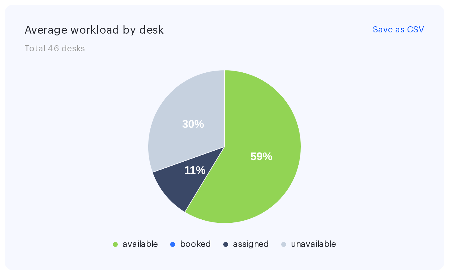
The pie chart splits all places into four types and shows how they were distributed on average over the period. The heading is Average workload by desk for desks and Average workload by parking place for parking; the subtitle counts the total.
| Segment | What it is |
|---|---|
| available | Places open for booking and taken by nobody |
| booked | Places occupied by ordinary employee bookings |
| assigned | Places permanently assigned to a specific employee — nobody else can book them |
| unavailable | Places switched off from booking by an administrator |
How it is calculated. The maths runs on place-days rather than places: every place on every working day of the period gets one of the four statuses. The total number of place-days equals the number of working days multiplied by the number of places. The share of each type is calculated against that total and then converted back into a number of places by multiplying the share by the total. Available places are what remains — the total minus booked, assigned and unavailable.
Because of this the numbers on the chart are averages over the period, not a snapshot of one day. If 20 places were occupied on 10 days out of 20 working days, the chart shows 10 booked places, not 20.
Non-working days are excluded. Weekends and public holidays from the company calendar are left out of the denominator, so the workload is not diluted by days off. A side effect: a booking made for a non-working day does not appear in this chart at all.
The percentage label inside a sector is shown only if the segment takes up at least a tenth of the circle; for smaller segments the value is visible in the tooltip. Hovering brings up a block headed Total desks: N with rows such as available: 106 (54%). If all four values are zero, No data to display is shown instead of the chart.
Average workload by day of the week
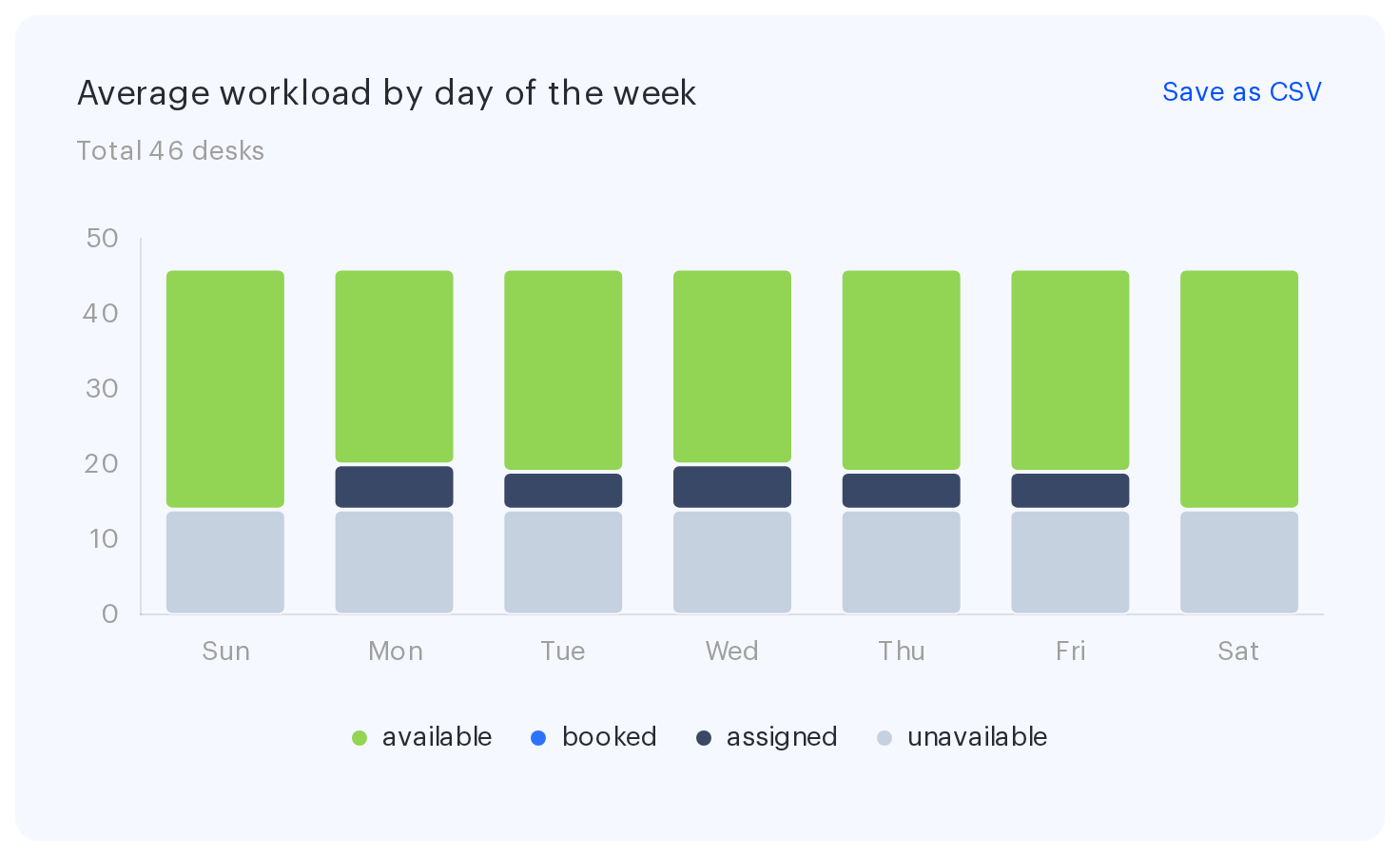
The bar chart answers the question of which weekdays the office is busier on. Each column is one day of the week split into the same four place types as the pie chart. The order of the days follows the company The first day of week setting.
How it is calculated. Every date of the period is grouped by its day of the week — all the Mondays of the period, for instance. Inside a group the values for each place type are averaged and rounded. The sum is then fitted to the total number of places and the available ones are derived as the remainder, which is why every column has the same height, equal to the total number of places, and only the composition differs.
Hovering over a column shows its day of the week with the total number of places, plus the breakdown by type with percentages. The legend under the chart repeats the four colours of the pie chart. Unlike the pie chart, the weekend columns are built from every calendar date of the period — if employees book places on a Saturday, it will show up here.
What it is good for: if Monday and Friday are noticeably emptier than midweek, that is the typical picture of a hybrid schedule, and it tells you which days you can cut floor space on or schedule all-hands meetings for.
Trend of usage
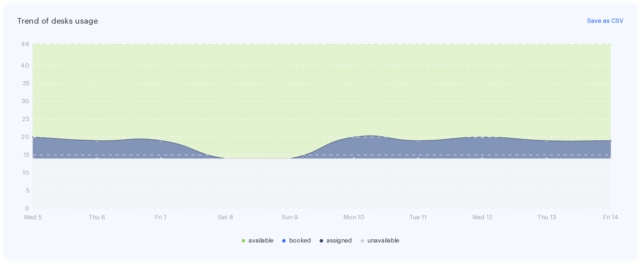
The last block is a chart by date across the full width of the page, titled Trend of desks usage or Trend of parking places usage. Unlike the two charts above it does not average anything: every point is a specific day of the period with its own distribution of places across the four types. The layers stack on top of each other, so the upper boundary of the chart is the total number of places.
This chart reveals what averaging hides: dips during holiday weeks, the spike when people return from leave, a gradual month-over-month rise in occupancy. Hovering over a point shows the date, the total number of places and the breakdown by type with percentages.
Non-working days are not removed from this chart: if somebody booked a place on a day off, or the company has places switched off from booking, that is visible on a non-working day too. This makes the trend the only block where a booking made for a non-working day shows up at all — the tile and the pie chart leave such days out of the calculation.
How parking differs from desks
The set of blocks, the way they work and all the formulas are the same for parking. The differences come down to the wording and the data behind it:
| Block | Desks | Parking places |
|---|---|---|
| Tile | Total N desks | Total N parking places |
| Attendance | Attendance | Attendance |
| Potential | Office potential | Parking capacity potential |
| Pie chart | Average workload by desk | Average workload by parking place |
| Bar chart | Average workload by day of the week | Average workload by day of the week — the heading is identical, go by the active tile |
| Trend | Trend of desks usage | Trend of parking places usage |
The assigned segment on parking means places permanently allocated to specific employees — a common arrangement for executives and company vehicles. In companies with many assigned places the share of available ones will be low even when there are few actual bookings: that is not an error, it reflects the fact that nobody else can use those places.
CSV export
The Download CSV button is available on three blocks: the pie chart, the bar chart and the trend. The tiles, Attendance and Potential have no export — those values are transferred by hand.
The file starts with a Filters block listing the period with its number of working days, the resource selection, the employee selection and the data source, so the export always states the settings it was built with. A Total row follows, and then the table itself:
| Block | Columns in the file |
|---|---|
| Pie chart | The place type name, Number and Percent (%) — one row per type |
| Bar chart | Days of the week, then a pair of columns per place type: number and percent |
| Trend | Date, then the same pairs of columns per place type |
The file name is built from the resource type and the chart title — for example Desks. Average workload by desk.csv or Parking. Trend of parking places usage.csv. The encoding is UTF-8 and the separator is a comma.