
On the map analytics: workplace usage heatmap
The heatmap is the top block of the On the map tab. It answers a question no summary chart can: where exactly in the office people are happy to sit and which corners stand empty. The floor plan is shaded by the usage intensity of every object — workplaces, meeting rooms and parking spaces. This article explains how to read the colour, where the percentages come from and why meeting rooms are calculated differently from desks.
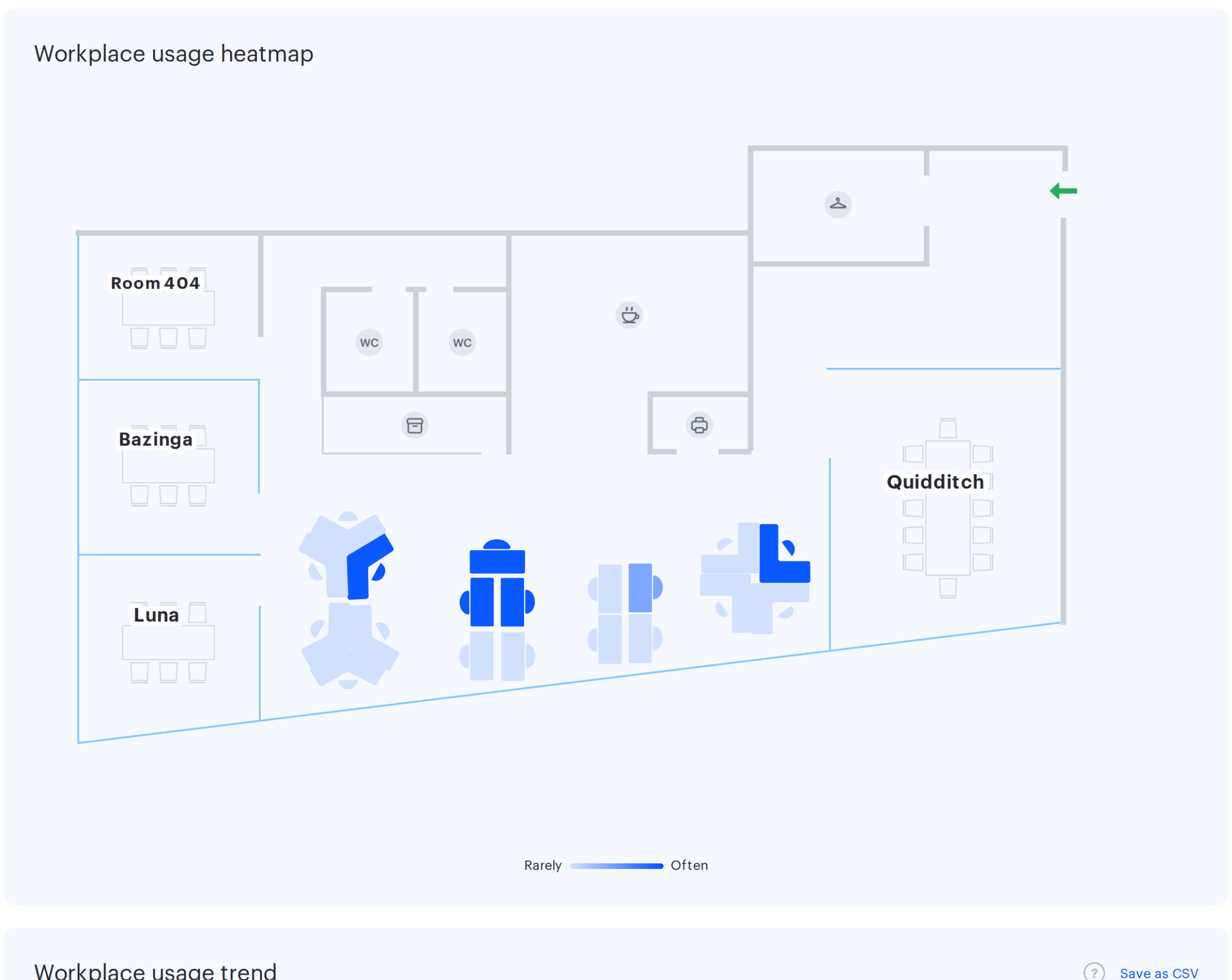
What the map shows
The block is called Workplace usage heatmap and draws the plan of the selected office with three kinds of objects laid over it.
- Workplaces — in the shape defined for the desk on the office map.
- Meeting rooms — as room outlines.
- Parking spaces — when the office has parking on this plan.
All three kinds are shaded with the same colour scale, but their percentages are calculated differently: desks and parking by days, meeting rooms by time. More on that below.
If the selected office has no plan, the map is replaced by the message There are no maps in this office. Choose another one. The same message appears when there is a plan but nothing on it — no desks, no meeting rooms, no parking. Disabled offices are not listed in the office filter at all, so the message does not concern them.
How to read the colour
The scale under the map is labelled Rarely on the left and Often on the right. The more intense the blue, the more often the object was used.
⚠️ The scale is continuous and has no thresholds or grades. The colour changes smoothly from very light blue at zero per cent to saturated blue at one hundred. There is no “green zone” and no “red zone”, and no threshold above which a desk counts as busy — the interpretation is yours to set.
⚠️ Zero per cent is not white. A completely unused desk is still shaded light blue. You cannot tell “never booked” from “booked a couple of times” by eye — hover over the object and read the tooltip.
⚠️ Disabled desks look exactly like the rest. A desk taken out of service stays on the map, and the disabled flag itself does not affect the colour: if the desk was booked before it was switched off, it stays dark. You see zero per cent only on a desk that was never booked in the whole period. If a whole group of pale desks sits in one corner of the floor, first check whether they are disabled, and only then conclude that the zone is unpopular.
Hover tooltips
| Object | What the tooltip shows |
|---|---|
| Workplace or parking space | Occupied – N%, X out of Y days |
| Meeting room | Occupied – N%, X out of Y h |
For a desk, X is the number of days with a booking and the denominator is the working days of the period. ⚠️ For a meeting room, X is not the sum of hours over the period but the average occupied time per working day, and the denominator is the length of the working day. So a room booked for 40 hours in a month shows not “40 out of 180 h” but around “2 out of 9 h”.
How the percentages are calculated
| Object | Formula | Unit |
|---|---|---|
| Workplace | days with a booking divided by the working days of the period | days |
| Parking space | the same | days |
| Meeting room | total booking time divided by the length of the working day multiplied by the number of working days in the period — the same days that form the denominator for desks | hours |
⚠️ Working days here means every day of the period except Saturday and Sunday. The company production calendar — public holidays, moved days, a custom working week — is not applied in this block. That is why the Weekday / Weekend counter in the page header and the denominator in a desk tooltip may disagree: the header counts by the company settings, the map by calendar weekends.
⚠️ Meeting room percentages are based on the default employee working hours set in the company settings, not on the schedule of the particular office. Only the part of a booking that falls within these working hours goes into the numerator: bookings outside working hours do not affect the colour of the room. For an office with non-standard opening hours the room occupancy share will be skewed.
Example. The period is a calendar month of 30 days containing 8 Saturdays and Sundays, so the denominator of the map is 22 days. A desk whose bookings started on 11 different days is shaded at 50%, and its tooltip reads “Occupied – 50%, 11 out of 22 days”. If the same month had two public holidays, the counter in the page header shows “Weekday: 20” — the map does not subtract holidays, and a difference of 22 against 20 is normal.
What enters the calculation
- For desks and parking, only the start day of a booking counts. A booking spanning several days shades one day — the first one, so for desks booked in long stretches the map understates the load. Meeting rooms work differently: a multi-day booking is split by day and every day counts separately, but for no more than eleven days from the start.
- Not counted: cancelled bookings and bookings released automatically because they were not confirmed by check-in.
- Counted: bookings the employee ended early.
- ⚠️ Assignment is not separated from booking. A desk permanently assigned to an employee is shaded exactly like a desk somebody books every day. On the map you cannot tell “in demand” from “taken by assignment” — for that look at the trend chart, where assignments have their own colour.
- Meeting rooms of the shared type appear on the map only when a calendar is connected to them.
- Booking dates are resolved in the office time zone when the office has the default settings switched off (here, unlike on By desks, the office working-day boundaries are not required); otherwise in the company time zone.
How the map differs from the trend
The two blocks of the tab sit on one page under one filter — and are calculated by different rules. This is the main source of “why do the numbers not add up” questions.
| Workplace usage heatmap | Workplace usage trend | |
|---|---|---|
| Which objects | desks, meeting rooms and parking, each shown separately on the plan | workplaces and parking spaces together, as one total |
| Office scope | the selected office only | the selected office and its direct child offices |
| Weekends | excluded from the denominator | included in the chart |
| Assignments | not separated from bookings | shown in their own colour |
| Disabled desks | not highlighted — shaded by bookings like any other desk | shown in their own colour |
| CSV export | no | yes |
The practical conclusion: for a parent office with children the two blocks describe different sets of desks — the map shows only its own, the chart counts the children as well. Comparing their numbers directly is not valid in that case.
Common questions
| What you see | Cause |
|---|---|
| “There are no maps in this office. Choose another one” instead of the plan | the office has no plan uploaded, or the plan carries no objects at all |
| Every desk is equally pale | there were almost no bookings in the period, or the period contains no weekday at all: with only a Saturday and a Sunday selected the map shows 0% on every object and the tooltip reads “0 out of 0 days” |
| “There are no desks in this office. Choose another one” under the trend chart | neither the office nor its child offices have desks or parking spaces; the message does not concern the floor plan |
| One group of desks is always pale | check whether those desks are disabled |
| A desk is dark although nobody books it | the desk is assigned to an employee — assignment shades it like a booking |
| The number of days in the tooltip does not match the header | the map excludes only Saturday and Sunday, the header counts by the company calendar |
| Load is lower than expected for desks with long bookings | a multi-day booking counts as a single day |
| A meeting room is missing from the map | the room is not placed on the office plan, a shared room has no calendar connected, the room is archived, or it belongs to a child office |