
On the map analytics: overview
The On the map tab answers a question no summary report can: where exactly in the office people are happy to sit, and which zones stay empty. It has two blocks — a heatmap laid over the floor plan and a day-by-day usage trend chart. This article is the entry point: it explains who has access to the tab, how to set the filters, what the trend chart shows and why two blocks on the same page follow different rules.

Who can see the tab
The On the map tab is available to the roles Super Administrator, Office manager, Offices Administrator and Integrations Administrator. A regular employee does not see it, even if they head a department — this is where the tab differs from By office, which a manager may open with a restriction to their own departments.
⚠️ There is no link to the tab in the side menu — you can only reach it through the tab bar of the Analytics section.
How to open it and what to set up
Open Analytics → On the map. The header contains two controls and a day counter.
| Control | What it does | Default |
|---|---|---|
| Office selector | an office tree; ⚠️ there is no “All offices” option and the selection cannot be cleared | the first office in the order the server returned them |
| Period | a calendar with grouping switches | from “today minus four weeks” to yesterday |
| The Weekday / Weekend counter | a reference value calculated from the company production calendar | — |
⚠️ The office list itself is sorted alphabetically, but the pre-selected office has nothing to do with that order — it can turn out to be any office in the company. Before you read the numbers, check which office is selected.
The Users Administrator role does not see the tab in the tab bar, but the page opens for it by a direct link.
⚠️ The length of the period on this tab is not limited in any way — you can pick a whole year. The By office, By employee, By employees and By desks tabs enforce a three-month limit; here there is none. On long periods the page takes noticeably longer to respond.
⚠️ The day counter in the header is not the denominator of the charts. It is calculated from the company settings, while the blocks on the page count days by their own rules. These numbers do not have to match.
The two blocks of the page
| Block | Question it answers | Details |
|---|---|---|
| Workplace usage heatmap | where in the office people sit more often and where almost never | Workplace usage heatmap |
| Workplace usage trend | how the mix of available, booked, assigned and unavailable desks changed day by day | in this article, below |
⚠️ The blocks are calculated by different rules. This is the main source of “why don’t the numbers add up” questions, and the differences are worth knowing before you start comparing figures.
| Heatmap | Trend | |
|---|---|---|
| Which objects | desks, meeting rooms and parking separately | desks and parking spaces together, as one total |
| Office scope | the selected office only | the selected office and its direct child offices; levels deeper than the second are not included |
| Weekends | excluded from the denominator | included in the chart |
| Assignments | not separated from bookings | shown as a separate colour |
| Disabled desks | not highlighted — shaded by bookings like any other desk | shown as a separate colour |
| CSV export | no | yes |
The practical conclusion: for a parent office with child offices, the two blocks describe different sets of desks, so their numbers cannot be compared directly.
Workplace usage trend
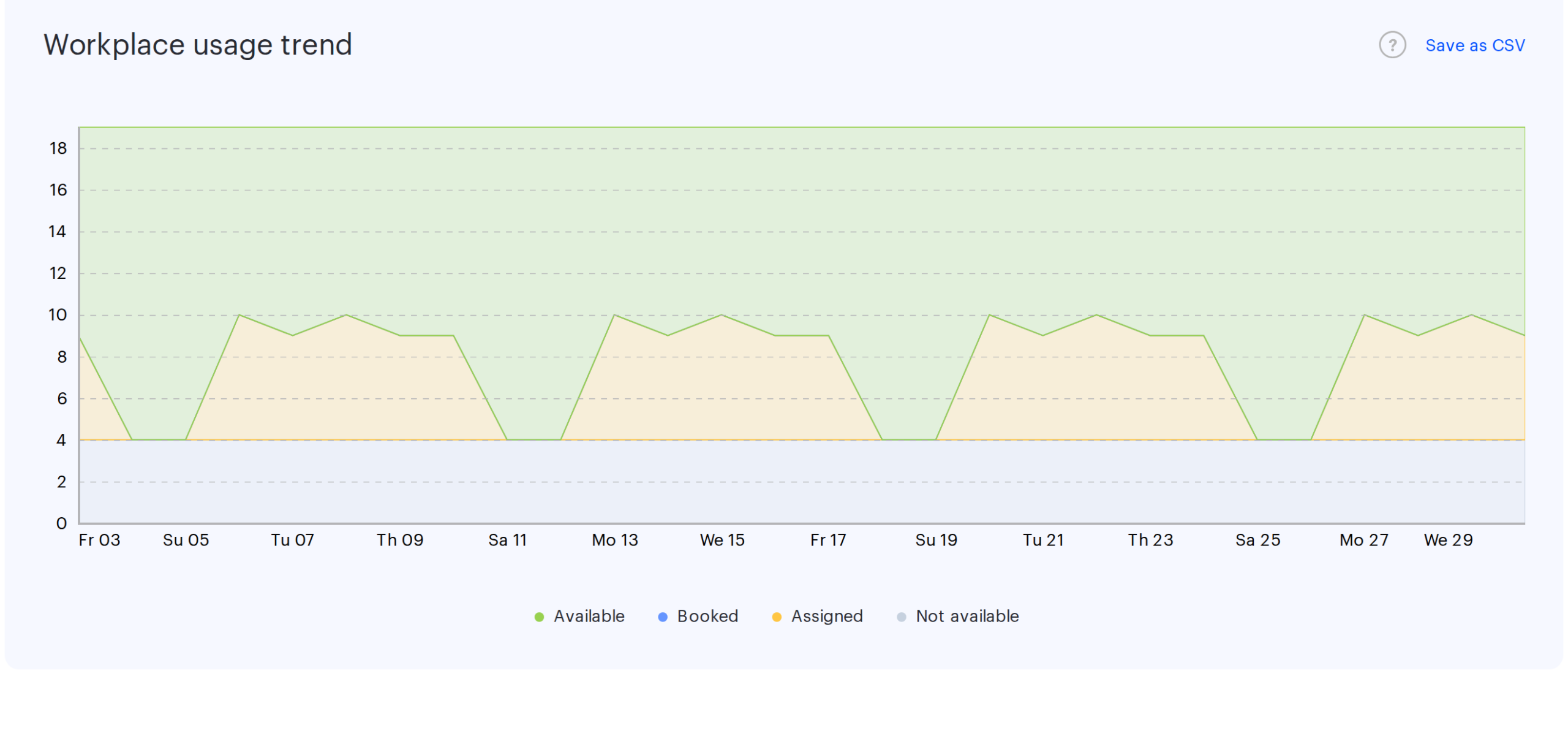
The stacked chart shows how the mix of office resources changed over the period. Days run along the horizontal axis and the number of resources along the vertical one. Free desks are calculated as the remainder: booked, assigned and unavailable resources are subtracted from the total.
⚠️ The height of the area is the same on every day of the period and equals the current number of desks and parking spaces in the office. The composition is not recalculated per day: a desk created in the middle of the period is present in the stack from the very first day, and a deleted one disappears from every day at once.
| Legend layer | What it means |
|---|---|
| Available | the desk was available but nobody took it |
| Booked | the desk had a booking for that day |
| Assigned | the desk is taken by a permanent assignment to an employee |
| Not available | the desk was disabled on that day |
Every desk falls into exactly one layer per day, by priority: an assignment overrides a booking, a booking overrides the available state, and “not available” is only applied on top of the available state. The disabled flag is taken from the change log as of the end of the day, so a desk disabled in the middle of the period appears in other layers up to that date.
What to keep in mind when reading the chart:
- ⚠️ Desks and parking spaces share one stack. The vertical maximum is their sum, not the number of desks.
- ⚠️ Child offices of the selected node are included in the chart, unlike in the heatmap.
- ⚠️ Weekends are not excluded from the chart — on Saturday and Sunday you will see a column that is almost entirely “available”, and it drags down the visual impression of the workload.
- Only the start day of a booking is counted. A multi-day booking colours a single day — the first one.
- Bookings ended early are counted — they were already registered on their start day.
- ⚠️ The day of a booking on this chart is resolved in the company time zone, even when the office has one of its own. For offices in other time zones a booking can land on the neighbouring day — the heatmap on the same page counts in the office time zone, which is one more reason the numbers of the two blocks differ.
- Not counted: cancelled bookings and bookings removed automatically because they were not confirmed with a check-in.
- The date in the hover tooltip is shown in DD.MM.YYYY format regardless of the interface language.
If neither the office nor its child offices have desks or parking spaces, the chart is replaced by the message “There are no desks in this office. Choose another one”. The message does not concern the floor plan.
CSV export
The Save as CSV button exists only for the trend chart; the heatmap has no export. The file contains one row per day of the period.
| Column | Format | What it contains and what for | Example |
|---|---|---|---|
| Date | date in the regional format | the day of the period, one row per calendar day, weekends included | 14.04.2026 |
| Was not booked | whole number | how many resources stayed free on that day | 106 |
| Was assigned | whole number | resources taken by a permanent assignment to an employee | 18 |
| Was booked | whole number | resources that had a booking on that day | 62 |
| Was not available | whole number | resources disabled as of the end of that day | 12 |
- The column separator depends on the interface language: in English and German it is a comma.
- The four numeric columns of a row normally add up to the total number of resources in the office on that date — a convenient way to check that the export is complete; a difference of one is rounding.
- If the period reaches into the future, a note is added as the first row of the file warning that booking information for the upcoming dates may change.
- The file name is assembled from the report name, the office name and the boundaries of the period.
How the tab differs from By office
Both tabs are about office workload, but they answer different questions.
- On the map is a spatial view: where in the office desks are used more often, on the floor plan, for one office, plus the day-by-day dynamics.
- By office gives summary figures per resource type: attendance, capacity potential, average workload by day of the week, and separate sections for meeting rooms, lockers and PACS data. There is no floor plan there.
- Meeting rooms and parking are visible on the map on this tab, but there are no dedicated summaries for them here — those live on By office and on the Meeting Rooms tab.
Limits and typical questions
| What you see | Reason |
|---|---|
| “All offices” cannot be selected | there is no such option; the report always covers one office |
| “There are no maps in this office. Choose another one” | the office has no floor plan uploaded, or the plan carries no objects at all — no desks, no meeting rooms, no parking |
| “There are no desks in this office. Choose another one” | neither the office nor its child offices have desks or parking spaces |
| The chart dips every five days | these are weekends; they are not excluded from the chart |
| The chart is taller than the number of desks | parking is included in the stack |
| The map and the chart disagree on the number of desks | the office has child offices: the map counts its own desks only, the chart counts the child offices too |
| Workload looks understated for desks with long bookings | a multi-day booking is counted as a single day |
| There is no floor filter | a single map is taken, from the selected office |
| The page responds slowly | the selected period is too long — there is no limit here |