
By office analytics: overview
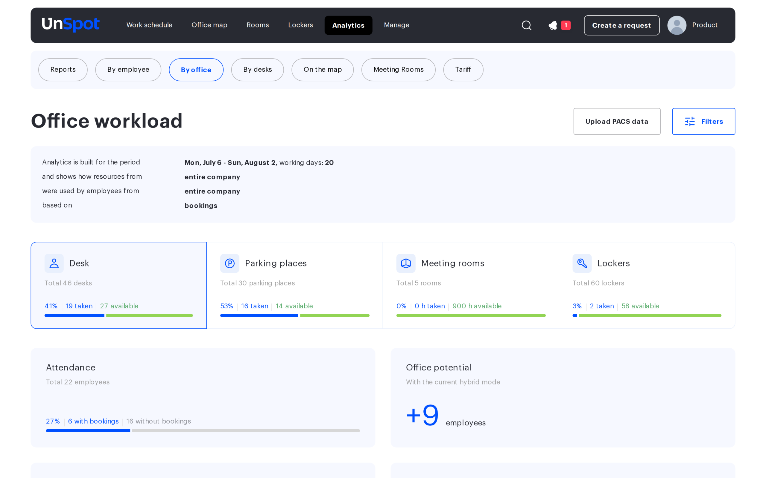
The By office tab — titled Office workload — is the summary analytics of how the company uses its resources: desks, parking places, meeting rooms and lockers. It answers questions such as whether the office is big enough, which days and hours it is busy on, how much of the team comes in at all, and whether bookings match the actual entries. This article is the entry point: it shows how the page is arranged and which detailed article covers the chart you need. Days in employee schedules — office, remote and non-working — are counted by the neighbouring By employees tab: it looks at people, not resources.
What you need
Open Analytics → By office. Access to the tab is defined by having subordinates, not by the role: it is visible to an employee with any role whose user card has Subordinates set to All users, or who has at least one subordinate — through the Subordinates list, the Manager field in another employee’s card, a team, or as a department manager. An administrative role on its own does not grant access: even a Super Administrator needs subordinates or the All users option to open the tab. For an employee without the All users option the analytics counts their subordinates and the employee themselves. The Upload PACS data button is available to a Super Administrator only.
When you first open the page the analytics is already built for the last four weeks up to and including yesterday, for the entire company and based on bookings.
Which question goes where
| Question | Where to look | In detail |
|---|---|---|
| How many more people the office could take in under the current way of working | The Desk tile, the Office potential block | Desks and parking |
| How much of the team comes to the office at all | The Attendance block on the Desk tile | Desks and parking |
| Which weekdays the office is emptier on | The Average workload by day of the week chart | Desks and parking |
| Whether occupancy is rising or falling week over week | The Trend of desks usage chart | Desks and parking |
| Whether there is enough parking | The Parking places tile | Desks and parking |
| Which hours the meeting rooms are busy and whether new ones are needed | The Meeting rooms tile, the heat map | Meeting rooms |
| How long the meetings employees hold usually are | The Duration of meetings chart | Meeting rooms |
| How many locker cells are taken | The Lockers tile | Lockers |
| Whether bookings match the actual arrivals at the office | The By data filter set to PACS | PACS data |
| How to narrow the analytics down to a department, group or office | The Filters button | Filters and period |
How the page is arranged
The page reads from top to bottom in four layers.
- Parameters. The Filters button opens the Build analytics window with four filter sections: for the period, by resources, by employees and by data. The settings apply to the whole page at once.
- The description line. Under the title a sentence is shown such as Analytics is built for the period …, working days: 20 and shows how resources from the entire company were used by employees from the entire company based on bookings. It always states what is currently on screen.
- Resource tiles. Four tiles — desks, parking places, meeting rooms and lockers. Each shows the total and the share taken, and clicking a tile switches the set of charts below.
- Charts of the selected resource. Every tile has its own set of blocks — from five for desks down to one for lockers.
The filters, all of their options and a breakdown of the description line are covered in By office analytics: filters and period.
Desks and parking
Two tiles with an identical set of five blocks:
- Attendance — how many employees used the resource.
- Office potential — how many more people would fit under the current usage pattern.
- Average workload by desk — the pie chart splitting places into available, booked, assigned and unavailable.
- Average workload by day of the week — the bar chart.
- Trend of desks usage — a day-by-day chart across the whole period.
The formulas are identical for both resources; only the data and some of the headings differ. A breakdown of every block with its formulas, legends and export contents is in By office analytics: desks and parking.
Meeting rooms
The meeting rooms tile counts hours, not rooms: 180 h taken with Total 5 rooms. The set of blocks differs here as well:
- instead of a split by place type there is the Duration of meetings chart — the shares of bookings lasting 15 minutes, 30, 45, an hour, an hour and a half, two hours and over two hours;
- the bar chart shows percentages of available time with a highlighted high-usage zone;
- instead of a trend there is a heat map — seven days of the week by 48 half-hour intervals.
All five blocks are covered in By office analytics: meeting rooms. Do not confuse this with the separate Meeting Rooms tab, which shows the workload of each room individually.
Lockers
The simplest tile: the total number of cells and the share taken, plus a single Distribution of lockers by type chart with three segments — available, booked and unavailable. There is no attendance, no potential and no trend here.
In detail: By office analytics: lockers.
Analytics based on PACS data
The By data filter set to PACS builds the same analytics from actual entries recorded by the physical access control system instead of bookings. In this mode only the Desk tile remains, and the charts split into two segments instead of four — booked and available. The number of places counted as taken on a given day equals the number of unique employees who passed through the entrance: PACS events are not tied to a specific desk.
A discrepancy between the two sources is normal and is exactly what the mode exists for: it shows the gap between booked and actually turned up. How to upload the events and how to read the result: By office analytics: PACS data.
General rules for reading the numbers
- Tiles and pie charts count working days only. Weekends and public holidays from the company calendar are excluded from their calculation — which is why the description line carries a counter of the working days in the period. The day-of-the-week chart and the usage trend are built from every calendar date.
- Most numbers are averages over the period, not a snapshot of one day. Pie and bar charts average their values; day-by-day figures are visible only on the trend chart.
- The date of a booking follows the time zone of the office that owns the resource. For companies with offices in different zones this shows up around midnight boundaries. In PACS mode the day of an event is taken in the company time zone.
- Cancelled bookings and bookings released automatically for a missed check-in are not counted. They reach neither Attendance, nor the booked places, nor the Trend of desks usage.
- The period is limited to three months. The page will not build a longer range and shows a warning instead.
- Not every block has a CSV export. The Download CSV button sits on the pie and bar charts, the trend and the heat map; the tiles, Attendance and Potential do not have one. The current filters go into the header of every file.
Limitations and common misconceptions
- The By resources filter set to By department disables meeting rooms and lockers. Both tiles go grey because these resources are not assigned to departments. This is not a fault: to see their analytics, choose All, By group or By office.
- Taken on a tile is not only bookings. Places assigned to employees and places switched off by an administrator count as taken as well: nobody else can use them, so they are not counted as available.
- A booking made for a non-working day will not reach the headline figures. The tile and the pie chart leave it out, because non-working days are excluded from their calculation; you can still see such a booking on the usage trend chart and in the column of the matching day of the week.
- A tile for a resource the company does not have cannot be opened and reads This resource is not in use.
- The booking figures and the PACS figures do not have to agree. The counting rules differ between the modes, and the gap itself is a useful indicator.
- For a manager without the All users option the analytics counts their subordinates — by the five criteria, without nested departments — and the manager themselves. Employees of nested departments where they are not the manager are left out, even if such a department is selected in the filter. In the By employees section the By department option is available only to a department manager, By team (that is what By group is called for them) only if they have teams, and By office is not available at all; the By resources section keeps All only — see By office analytics: filters and period.
Related articles
- By office analytics: filters and period
- By office analytics: desks and parking
- By office analytics: meeting rooms
- By office analytics: lockers
- By office analytics: PACS data
- By employee analytics: overview
- By employees analytics: overview
- By employees analytics: the three charts and their calculation
- By desks analytics: overview
- On the map analytics: overview
- Meeting Rooms analytics: room workload
- Public holiday calendar