
By employees analytics: the three charts and their calculation
The By employees tab of the Analytics section offers three chart types: Schedule completion tracking, Employee Work Schedule and Attendance Rate Control. All three are built from the same data — the employees’ work schedules for the selected period — and break it down by the department, its direct employees and its subordinate departments. What differs is the set of statuses, the colouring and which rows end up at the top. This article covers each chart separately, plus the common calculation rules that make the figures look the way they do. How to open the tab, who can see it and what is set in the parameters window is covered in the overview article.
How to pick a chart
Open Analytics → By employees, click Filters and pick one of the three options of the Attendance monitoring group in the Chart type field. The chart type is the only required field of the window; the period, department and office can be left at their defaults. After saving, the page heading changes to the name of the chart.
| Chart type | Main question | Statuses in the bar | What is highlighted |
|---|---|---|---|
| Schedule completion tracking | who does not fill in the schedule | 4 | “not filled” — in red |
| Employee Work Schedule | how the days are distributed, including the company’s own statuses | 4 root statuses, with “remote” and “didn’t work” expanded into sub-statuses | sub-statuses — in the colours from the company settings |
| Attendance Rate Control | who is short of the required office days | 5 | “insufficient office days” — in red |
All three charts use the same blocks: Block 1 — the whole department, Block 2 — Employees Directly Reporting to the Department, Block 3 — Employees from Subordinate Departments. What each block contains and when it is shown is covered in the overview article.
Common calculation rules
Working days
Only the working days of the period are counted. A day that is marked in the schedule as a weekend or a public holiday according to the company’s work calendar is skipped entirely — it falls into no status and is not part of the denominator. The number of working days in the period is shown in the description line under the heading (working days: N) and, counted separately by the server, in the first line of the tooltip (Total working days: N). If the selection contains no employees at all, the working days are counted straight from the company’s work calendar.
Where the status of a day comes from
For every employee and every working day of the period exactly one status is determined. The sources are checked in order; the first one that applies wins.
| Priority | Source | Status the day gets |
|---|---|---|
| 1 | the status set in the schedule cell | the one that is set: “in office”, “remote” or “didn’t work”, the latter two together with the company sub-status if one is chosen |
| 2 | a desk booking for that day (including the automatic booking of an assigned desk) | “in office” |
| 3 | the work schedule template — only for dates from next week onwards | for an enabled template: an office selected → “in office”; otherwise the status of the template with its sub-status; otherwise a desk assigned in the template → “in office”. For a disabled template only the assigned desk counts |
| 4 | none of the above | “not filled” |
The third point has an important consequence: for the current week and the past the template is not used in the calculation — only the statuses already written into the schedule cells and desk bookings count. Future dates from next week onwards, on the contrary, are completed from the template, so the future part of the period is a forecast. More about the template in Work schedule template.
Percentages and “days”
Every row of the chart — an employee, a department or Total — is calculated the same way. First the person-days in each status are added up across all employees of the row, then they are divided by the number of employees and by the working days.
- Percentage of a status = person-days in that status ÷ (working days × number of employees in the row) × 100, rounded to a whole number.
- “Days” in the tooltip = person-days in that status ÷ number of employees in the row, rounded to a whole number — that is, the average per employee, not the sum. For a single employee’s row it is simply their own days.
- Normalisation. After rounding, the percentages of a row are adjusted to add up to exactly 100%. That is why an individual percentage may differ by one from a straight division of days.
Example: a department has 5 employees, the period has 20 working days, and together they spent 60 person-days in the office. The “in office” percentage = 60 ÷ (20 × 5) × 100 = 60%, days = 60 ÷ 5 = 12. The tooltip of the department row will show “12 days (60%)”.
Legend and tooltip
Under every block there is a legend with coloured dots. The percentage of a segment is written inside the bar, but only if the segment is wider than 4% (15% on a narrow screen); narrower segments are drawn without a label, as are segments into which the label text does not fit. The full values are always in the tooltip on hover: the first line is Total working days: N, then a dot, the name and N days (P%) for every status. An empty row with no day in any status is drawn with a grey background and the label 0%.
Schedule completion tracking
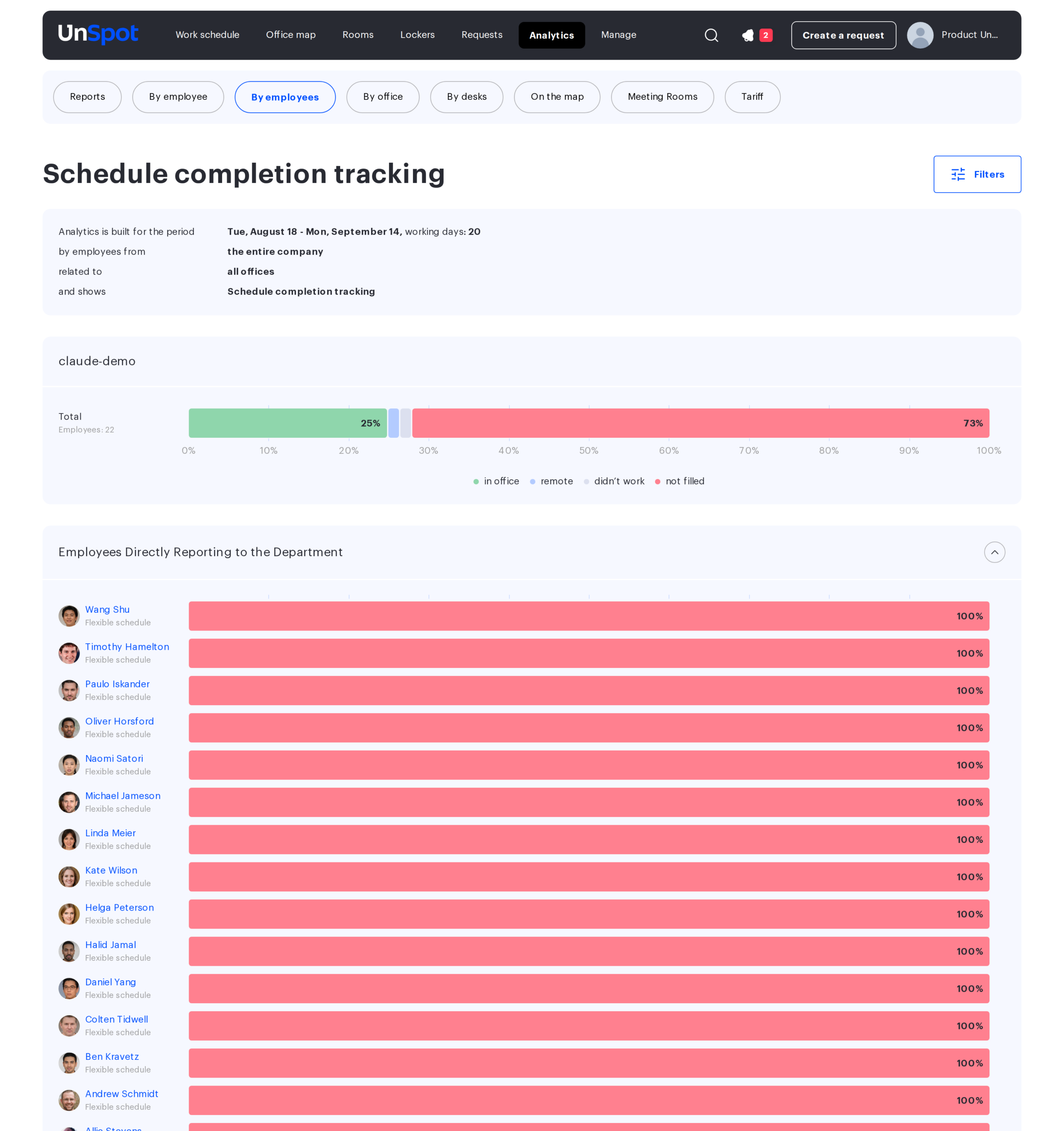
The chart for the question “who in the department does not keep the schedule”. The bar has four statuses; “not filled” is deliberately drawn in red so that the problem rows stand out.
| Status in the legend | Colour | What it means |
|---|---|---|
| in office | green | a day with the “in office” status, a desk booking or an office from the template |
| remote | light blue | a day with the “remote” status of any sub-status |
| didn’t work | light grey | a day with the “didn’t work” status of any sub-status |
| not filled | red | a working day for which no status, no desk booking and no template was found |
Company sub-statuses are not expanded in this chart: all remote days go into one segment, all “didn’t work” days into another. If you need the sub-statuses, choose Employee Work Schedule.
Row order. In Blocks 2 and 3 the rows are sorted by the share of “not filled” in descending order, then “in office”, “remote”, “didn’t work”, and by name in reverse alphabetical order when everything matches. So the employees and departments with the emptiest schedules always end up at the top of the expanded list.
Employee Work Schedule
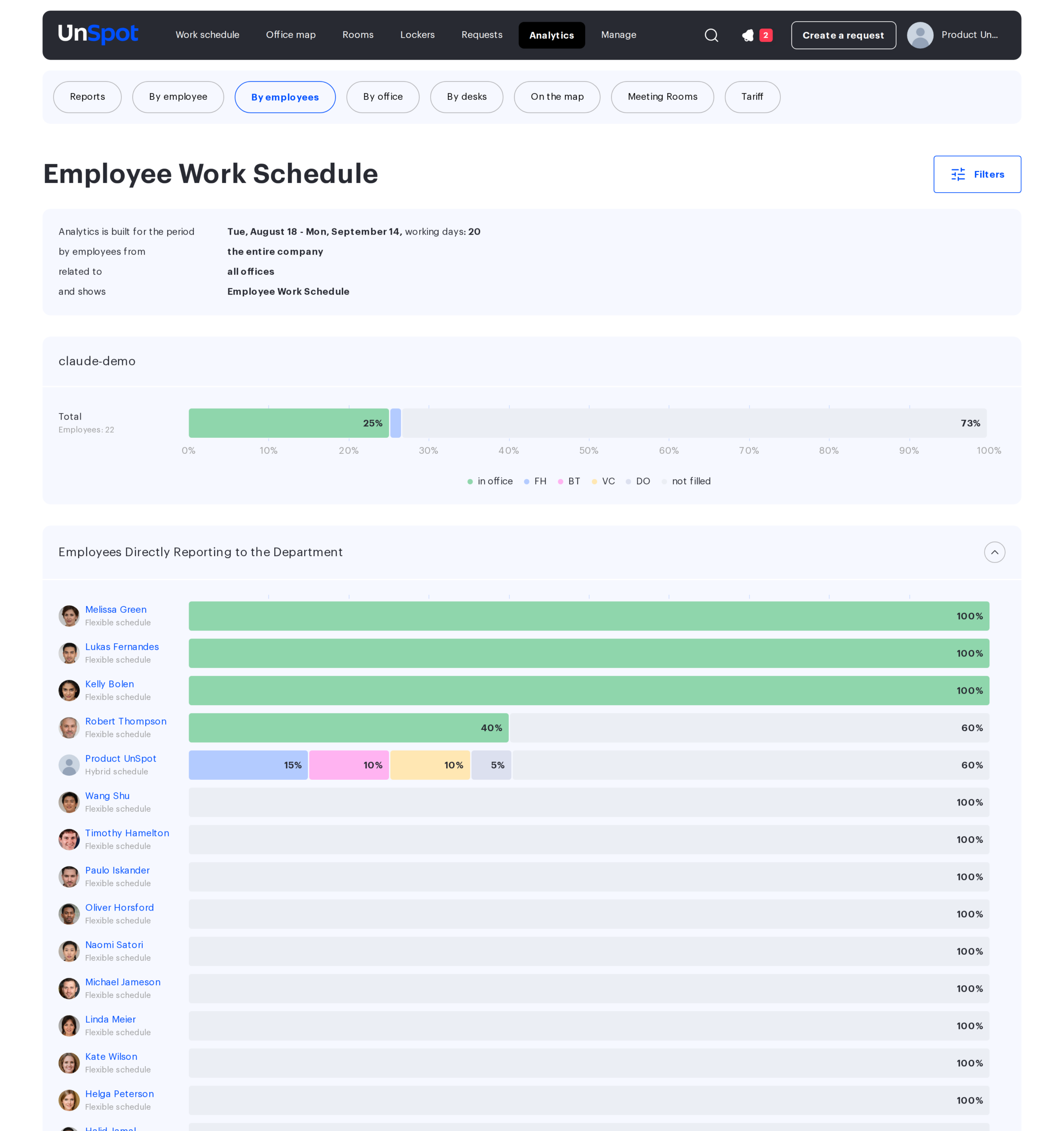
The same calculation, but with detail: the “remote” and “didn’t work” statuses are expanded into the sub-statuses configured in the company settings (for example, Business trip or Vacation). Every sub-status is drawn in its own colour from the settings and labelled in the legend with its short name. Days marked with a root status and no sub-status remain a separate segment named after the root status — “remote” or “didn’t work”. The “not filled” segment is not red here but very light grey: this chart answers “how are the days distributed”, not “who did not fill in”.
| Segment | Colour | Source |
|---|---|---|
| in office | green | as in Schedule completion tracking |
| sub-statuses of “remote” | the colour of each sub-status from the company settings | days with the “remote” status and a chosen sub-status |
| remote | light blue | the remainder: “remote” days without a sub-status |
| sub-statuses of “didn’t work” | the colour of each sub-status from the company settings | days with the “didn’t work” status and a chosen sub-status |
| didn’t work | light grey | the remainder: “didn’t work” days without a sub-status |
| not filled | very light grey | as in Schedule completion tracking |
The legend depends on the data: under Block 1 it lists every sub-status that occurred, while Blocks 2 and 3 share one legend built from the rows of Block 2 (or of Block 3 when there is no Block 2); the full list of statuses of a row is always in the tooltip. If the company has no sub-statuses configured, the chart matches Schedule completion tracking except for the colour of “not filled”. How to configure sub-statuses is covered in Manage statuses in the schedule.
Row order. Employees and departments are sorted by the share of “in office” in descending order, then “remote”, “didn’t work”, “not filled”, and by name in reverse alphabetical order when they match: those who come to the office most often are at the top. Sub-statuses inside a segment are ordered by their share in descending order.
Attendance Rate Control
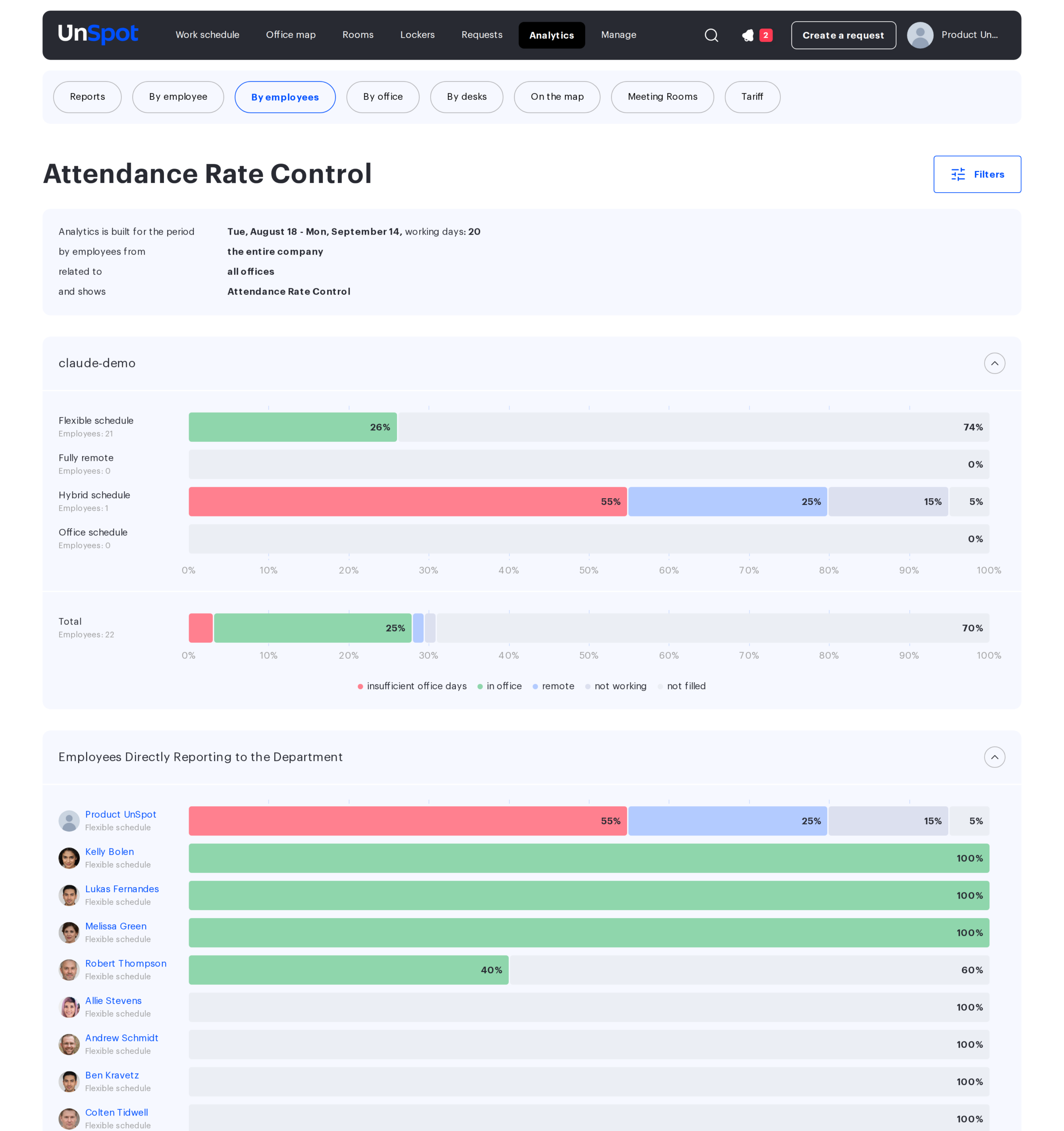
The chart for the question “who is short of the required office days”. A fifth status is added to the four — insufficient office days, in red. It shows how many days the employee fell short of the attendance rate set in their user card. The legend of this chart is fixed: five statuses in the same order for all blocks.
| Status in the legend | Colour | What it means |
|---|---|---|
| insufficient office days | red | the days missing to reach the rate; taken out of “not filled” and “remote” |
| in office | green | days in the office |
| remote | light blue | remote days minus what went into the shortfall |
| not working | light grey | the employee’s non-working days; they reduce the rate |
| not filled | very light grey | not filled days minus what went into the shortfall |
Note that the legend of this chart names the non-working status “not working”, while the two schedule charts call the same status “didn’t work”. They count the same days.
How the shortfall is calculated
The shortfall is calculated for every employee individually, against their attendance rate — the percentage of working days they are expected to spend in the office. The rate is set in the employee’s user card, see Office attendance mode and the attendance target.
- Rate in days = round up((working days of the period − “not working” days) × rate ÷ 100). The days the employee did not work are subtracted from the base of the rate: a vacation does not break the rate.
- Shortfall = rate in days − “in office” days, but never below zero. If the employee was in the office at least as many days as the rate, there is no shortfall.
- Where it is taken from. The shortfall days move into the red segment first out of “not filled”, and if there were not enough not filled days — out of “remote”. The total length of the bar does not change.
- When the shortfall is not calculated. If the employee’s rate is not set or equals zero (the Flexible schedule and Fully remote modes), no shortfall is calculated for them at all, and their bar consists of the same four statuses as in Schedule completion tracking.
Example: the period has 20 working days, the employee did not work for 2 days, the rate is 60%. Rate in days = round up((20 − 2) × 60 ÷ 100) = round up(10.8) = 11 days. The employee was in the office for 8 days, so the shortfall = 11 − 8 = 3 days. They have 2 not filled days and 8 remote days: both not filled days and one remote day go into the red segment, and the bar shows in office 8, remote 7, insufficient office days 3, not working 2.
The work mode and the rate are the same thing written in two ways. The mode is not stored separately but derived from the rate: an empty rate is Flexible schedule, 0 is Fully remote, 1 to 99 is Hybrid schedule, 100 is Office schedule; when a mode is picked in the employee’s user card, the form sets the rate itself. That is why employees in the flexible and remote modes have no shortfall, in the office mode all “remote” and “not filled” days go into the shortfall, and in the hybrid mode it follows the percentage of the rate. To change the calculation, change the mode or the rate in the employee’s user card.
Block 1: by work mode
Unlike in the other two charts, Block 1 here expands with the arrow and contains four rows — by the employees’ work mode; it is collapsed by default, showing Total and the legend. The order of the rows is fixed and does not depend on the data.
- Flexible schedule — employees with no work mode set land here as well.
- Fully remote
- Hybrid schedule
- Office schedule
Every mode row has the Employees: N caption and its own bar, calculated as the average across the employees of that mode. A mode with no employees is drawn as an empty grey bar. The Total row in the footer of the block counts the whole department. In this chart Block 1 is shown whenever there is any data — it is enough for the department to have either direct employees or subordinate departments.
Row order in Blocks 2 and 3 — by the share of the shortfall in descending order, then “in office”, “remote”, “not filled”, “not working”, and by name when they match. Those missing the most days are at the top.
Limits and pitfalls
- A segment narrower than 4% has no label. The percentage inside the bar is hidden when the segment takes less than 4% (less than 15% on a narrow screen) or when the label text does not fit into the segment. The value is not lost — hover over the bar and read the tooltip.
- “Days” is an average, not a sum. In the row of a 10-person department, “5 days” means 50 person-days. Departments of different sizes can be compared only by percentages and averages.
- The rate figure is not shown on this chart, and the work mode caption under the name currently reads Flexible schedule for every employee and does not reflect the mode — look them up in the employee’s user card.
- The work mode sets the rate. The mode and the rate change together in the employee’s user card: the flexible and remote modes have no shortfall, the office mode means a rate of 100%, the hybrid mode a rate from 1 to 99%.
- The office filter is not applied in the attendance rate chart. The Attendance Rate Control figures are counted across all offices, although the description line shows the selected office (a known defect). In the two schedule charts the filter works.
- “Remote” in the attendance rate chart is smaller than in the completion chart. That is by design: part of the remote days went into the shortfall. Compare segments of the same name only within one chart type.
- Past and current days without a status in the cell count as not filled: the template completes only dates from next week onwards. The exception is a desk booking: it gives “in office” on any date, and an assigned desk works through such bookings and through the template.
- Percentages are adjusted to 100%. Because of rounding and normalisation the sum of “days” across statuses may miss the number of working days by one, and a percentage may differ by one from a straight division.
- The Total row is not the sum of the list rows. Total in Block 3 is calculated across all employees of the subordinate departments as one group, not by averaging the department rows, so its percentages do not have to match the average of the rows.
Troubleshooting
| Symptom | Cause |
|---|---|
| An employee’s whole bar is “not filled” | there is not a single status in the schedule cells for the period and no desk booking; the template is not applied to past dates |
| An employee thought to be remote has “insufficient office days” | the attendance rate in their user card is not zero: the work mode is derived from the rate, so the employee counts as hybrid or office — check the user card |
| The Employee Work Schedule legend has no sub-statuses | the company has no sub-statuses configured, or none of them occurred in the rows the legend is built from (Blocks 2 and 3 share one legend); the full list is in the tooltip |
| There is no Block 1, only one block | in the schedule charts Block 1 is shown only when the department has both direct employees and subordinate departments |
| A work mode row in Block 1 is empty and grey | there are no employees with that mode in the selection |
| The “not filled” segment disappeared in the attendance rate chart although it is present in the completion chart | not filled days are the first to go into “insufficient office days” |
| The sum of “days” across statuses does not equal the number of working days | “days” is a rounded average per employee; a difference of one is normal |
| The percentage inside a bar is not labelled | the segment is narrower than 4% (15% on a narrow screen) or the label text does not fit into it; the value is in the tooltip |
| Employees: N is smaller than the department headcount | you are not allowed to manage all users — only the employees available to you were counted; devices are not counted |