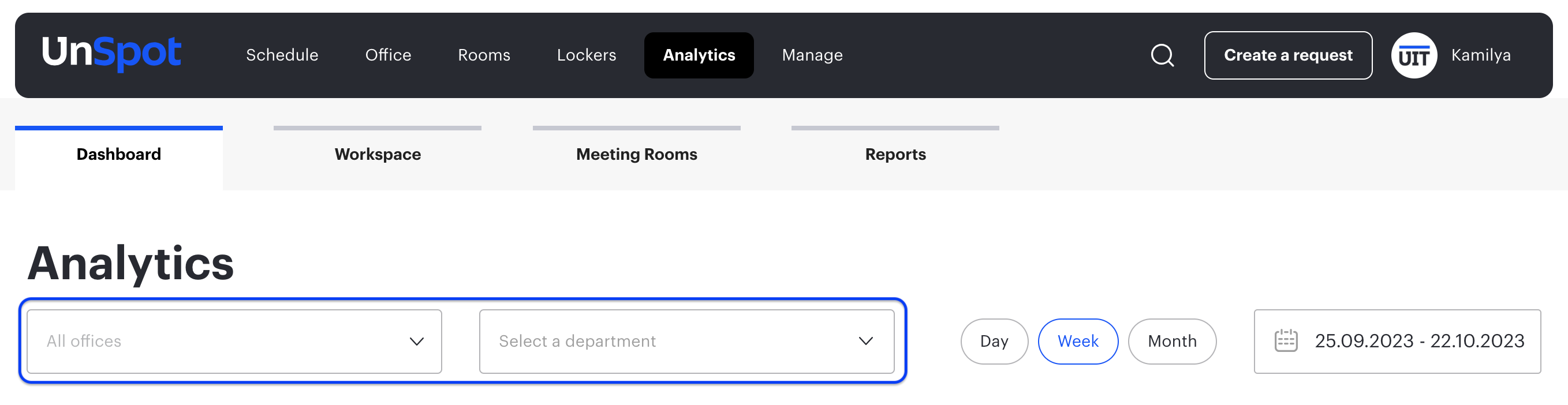
Dashboard
Go to the Analytics > Dashboard
On the Dashboard panel you can view booking analytics by different metrics for any time interval, which does not exceed 3 months. You can build graphs by office and department, just select the desired office or department and set the period.
Graphs of indicators
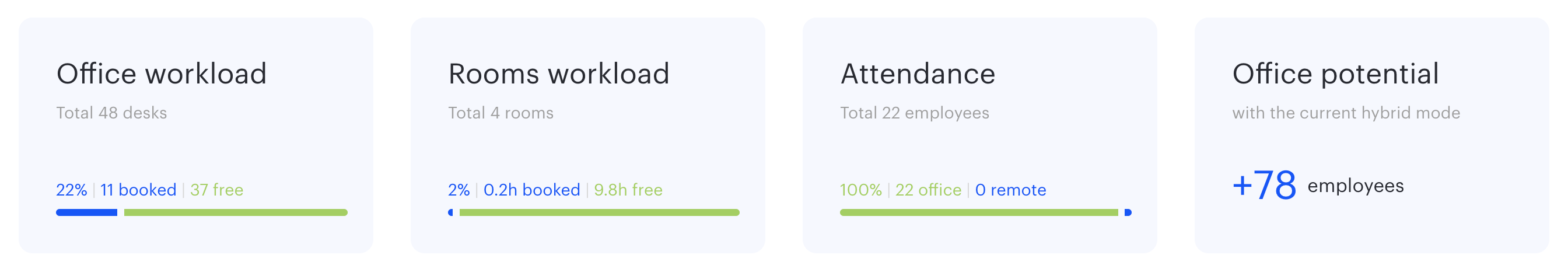
- “Office workload” graph – shows the number of booked and available desks for the selected period
- “Room workload” graph – shows the number of hours of meeting room booking for the selected period
- “Attendance” graph – shows how many users worked from the office and how many worked remotely
- “Office Potential” graph – shows how many more employees can be hired at the current attendance level
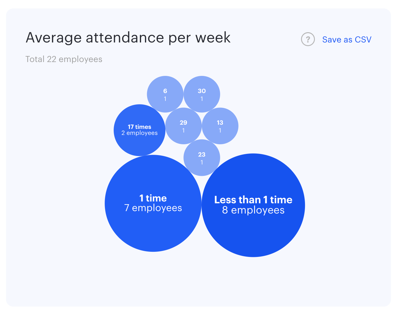
Average office attendance
In this graph, you can see what employee attendance was on average per week in the selected period.
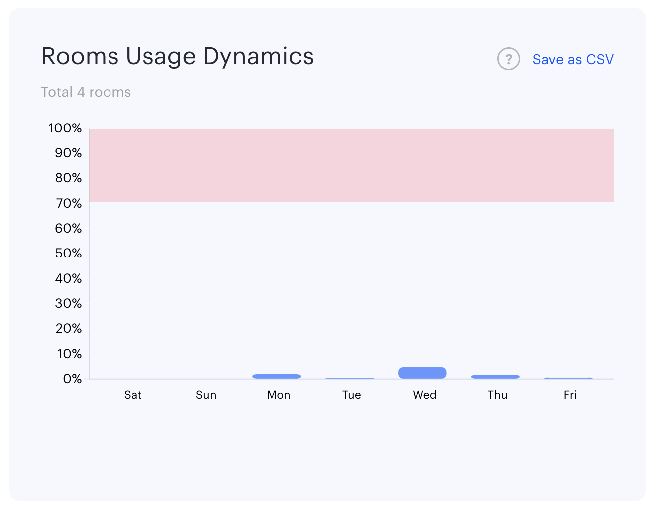
Room usage dynamics
The chart shows the usage statistics of all meeting rooms in the selected office for the week, divided by day.
Hint: 100% workload means that all meeting rooms in the office have been booked for all working hours. Optimal workload for meeting rooms is between 50% and 70%.
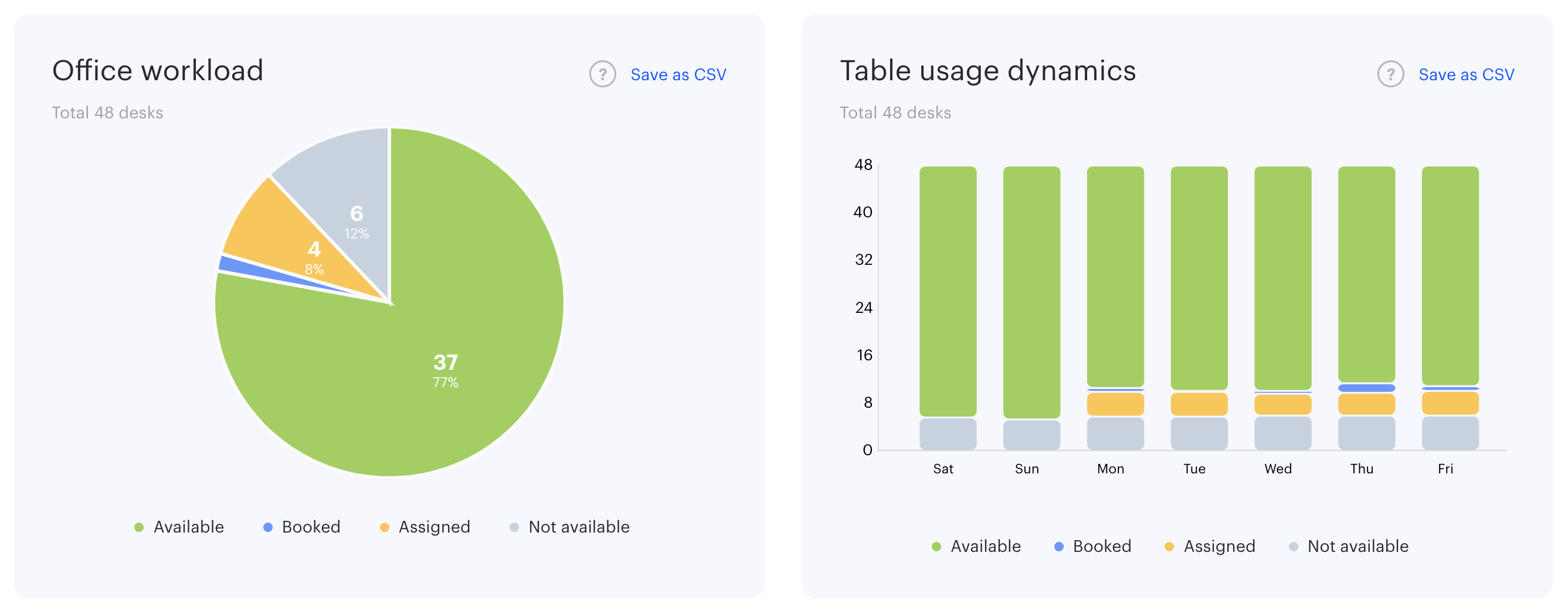
Desks
The pie chart shows the ratio of available, booked, assigned and not available desks in the average value by number for the selected period, excluding weekends.
The bar chart of desks usage dynamics shows the ratio of booked, available, assigned and not available desks by day on a weekly interval.
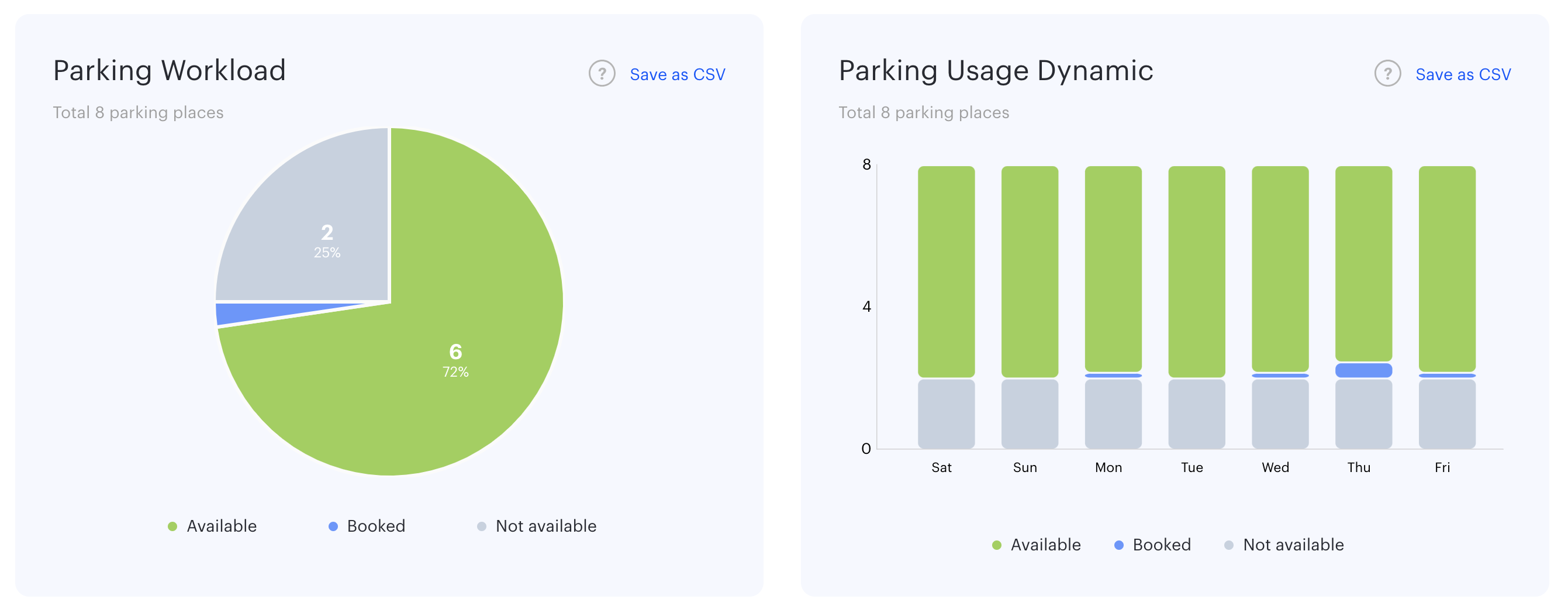
Parking
The pie chart shows the ratio of available, booked and not available parking spaces in the average number of parking spaces for the selected period, excluding weekends.
The bar chart of parking usage dynamics shows the ratio of booked, available and not available parking spaces by day on a weekly interval.